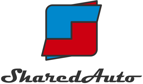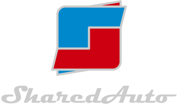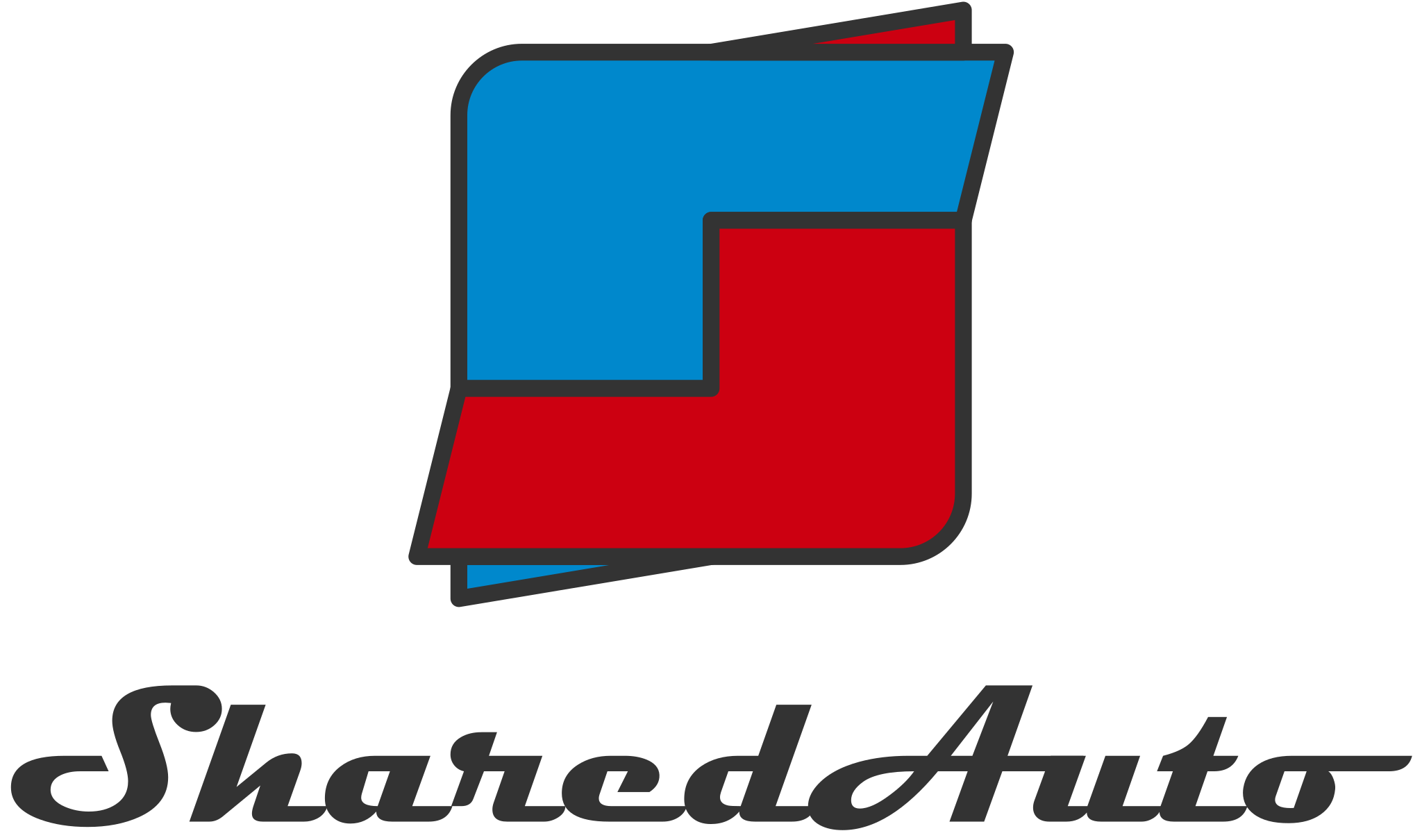
Primary lockup
Full colour · light
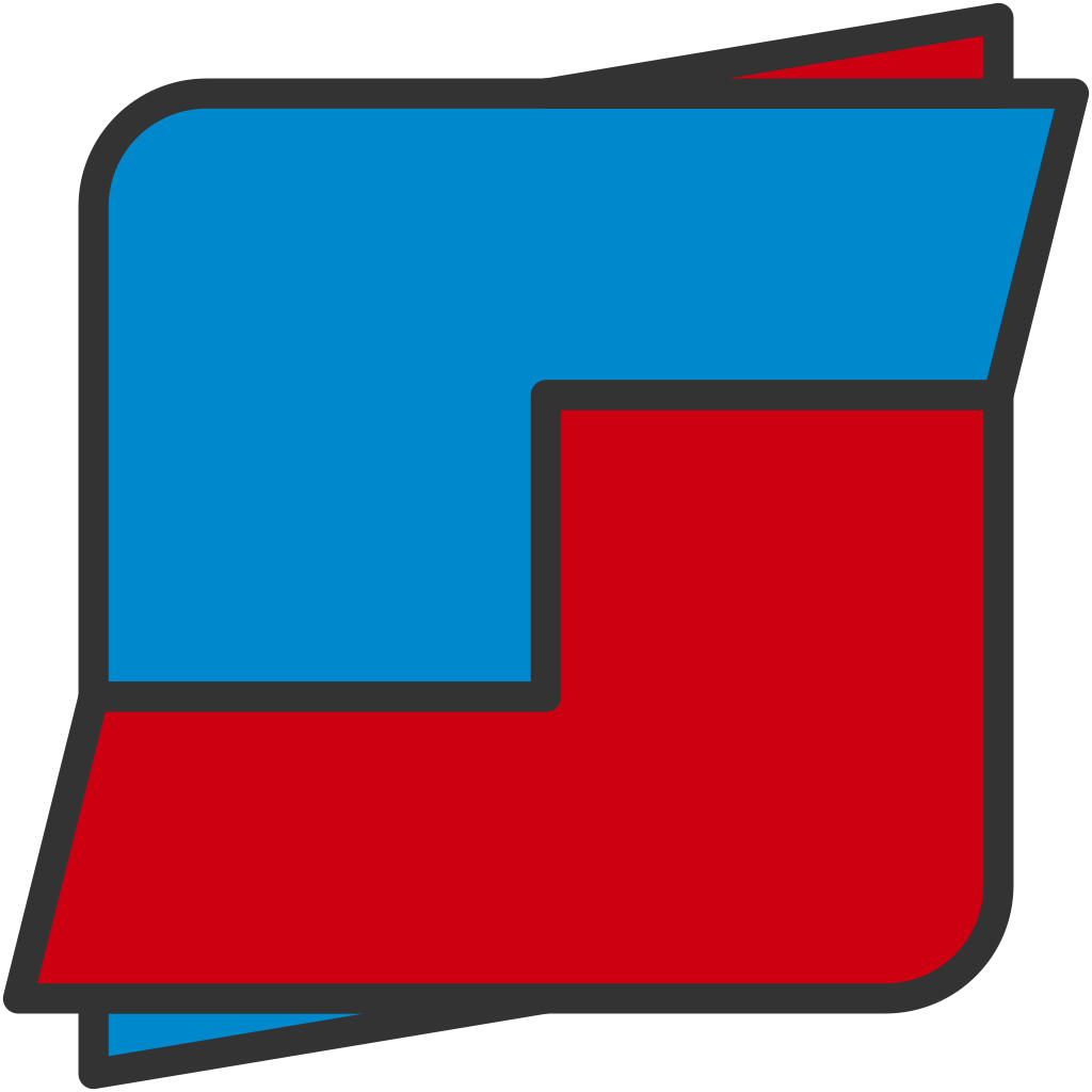

This document defines the correct construction, colours and usage of the Shared Auto Cars identity.
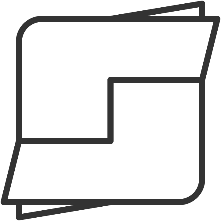
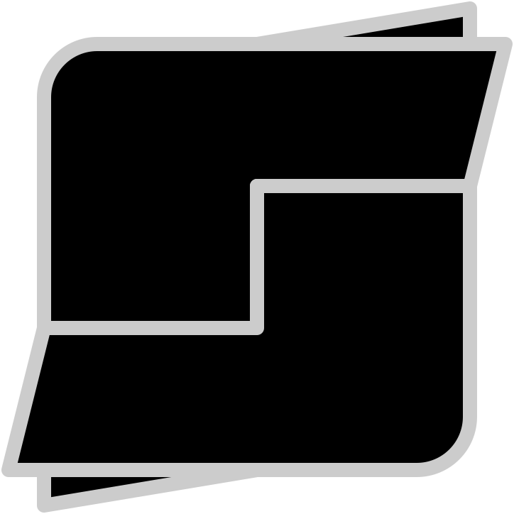
The Shared Auto Cars logo consists of a symbol and a wordmark. Together they form the primary lockup shown on the left; each part may also appear alone where this manual permits it.
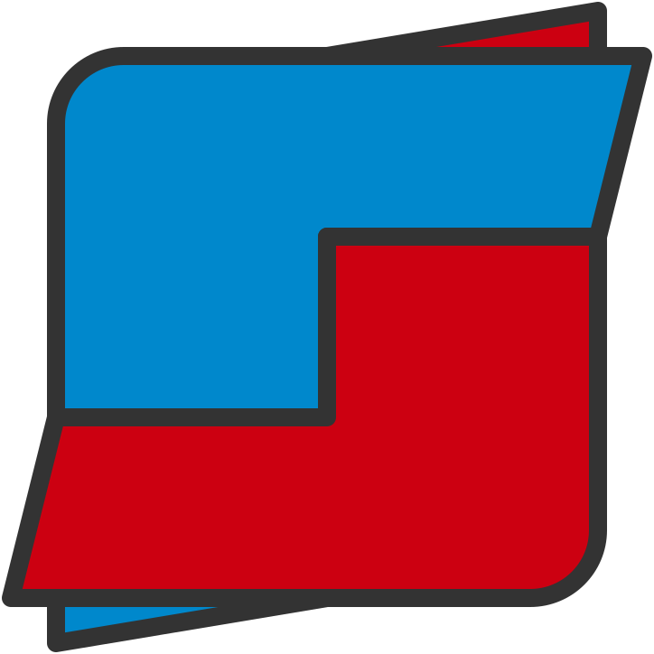
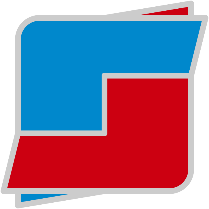
Two identical forms - one blue, one red - rotate around a common centre and interlock without touching. They read as two cars passing, and as two hands in an exchange: buyer and seller, trade-in and drive-away. The detached triangular flicks at opposite corners add direction and momentum, echoing motion lines in automotive design.
The wordmark reads 'SharedAuto', set in Magneto Bold, a streamlined script drawn from the chrome badges of classic automobiles. The word 'Cars' was retired in version 2.1. It is always reproduced from master artwork - never retyped, respaced or restyled.
3 x 0.5
3 x 4
3 x 4
3 x 0.5
6 units
6 units — basis for construction: 6 x 6 square
All geometry derives from a 6 x 6 unit square. Each coloured form is an L-shape made of a 3 x 4 column joined to a 4 x 2 band, so the two forms are identical: the red form is the blue form rotated 180 degrees about the centre.
Each band extends 0.5 unit beyond the square into a tapering point, and a detached 3 x 0.5 triangle sits on the opposite corner. The full footprint of the symbol is therefore 7 x 7 units.
Never redraw the symbol. Always reproduce it from master artwork; this grid exists only to verify artwork and to guide large-format or environmental reproduction.
Radius: a 1.5 x 1.5 circle placed at the corner of a 3 x 3 square
Only two corners of the symbol are rounded: the top-left of the blue form and the bottom-right of the red form. The radius equals 0.75 unit - the radius of a 1.5 x 1.5 circle set into the corner of a 3 x 3 square, as shown on the left.
Every shape carries a keyline of 0.2 unit, centred on the shape edge, with rounded joins and caps.
On light backgrounds: Grey 80% (#333333)
On dark backgrounds: Grey 20% (#cccccc)
The keyline is part of the logo. It must never be removed, thickened, thinned or recoloured.
Both rounded corners and the keyline at correct weight (0.2 unit).
Red leads, blue supports. Red is the energy of the brand - use it for primary accents, calls to action and the leading colour in layouts. Blue is the trust colour - use it for secondary accents and supporting elements. Within the symbol the two always appear together and their positions are fixed.
* Pantone references are the closest visual matches for spot-colour printing. Always verify against a physical Pantone swatch with your printer before production; the CMYK values above are the authoritative print values.
Keyline and wordmark on light backgrounds
Keyline and wordmark on dark backgrounds
Fills in the dark monochrome version
Fills in the light monochrome version
The neutrals do the quiet work of the identity. Grey 80% carries the keyline and the wordmark on light surfaces, and Grey 20% takes over on dark surfaces. Black and white replace the brand colours in the monochrome logo versions shown on the next page. Neutrals may also be used freely for text and layout backgrounds.


Preferred version.
Use on white and light backgrounds. Grey 80% keyline.
Use on black and dark backgrounds. Keyline and wordmark switch to Grey 20%.
Single-colour printing on light stock; white fills with Grey 80% keyline.
Single-colour reproduction on dark surfaces; black fills with Grey 20% keyline.
No other colour combinations are permitted. The fills, keyline and wordmark tone always change together as a set; elements from different versions must never be mixed.
Magneto Bold — reproduced from master artwork only
The wordmark is set in Magneto Bold in Grey 80% (Grey 20% on dark backgrounds). It is treated as fixed artwork: never retype it, change its spacing, or set other text in Magneto. The face is reserved exclusively for the company name.
All communications - headings, body copy, price lists, advertising and signage text - are set in Arial (or Helvetica where Arial is unavailable). Use Bold for headings and Regular for body copy. This manual is set in the supporting typeface throughout.
Hierarchy in practice: headings in Arial Bold, Grey 80% - body copy in Arial Regular, Grey 80% on light or Grey 20% on dark - accents and highlights in Shared Auto Red - links and secondary accents in Shared Auto Blue.
The preferred format wherever space allows: covers, signage, posters, profile images and the showroom fascia.

For wide, shallow spaces: letterheads, website headers, email signatures, vehicle decals and sponsorship strips.
Proportion rule: the symbol stands 1.75 x the height of the wordmark ('h'), separated from it by one 'h', with the wordmark optically centred on the body of the symbol.
The symbol may appear alone only where the brand is already established in context (app icons, social avatars, watermarks). The wordmark never appears without the symbol on first use in any document.
Clear space: 'x' equals the cap height of the wordmark.
Keep
at least one 'x' free of any other text, graphics or page edge on all four sides of every lockup.
Below these sizes the keyline and speed flicks begin to fill in.
If the logo must appear smaller, use
the symbol alone.
These examples are illustrative, not exhaustive: any alteration of the logo's geometry, colours, keyline or arrangement is prohibited.
White — preferred
Light grey — allowed
Deep blue — allowed
Black — allowed
Mid grey — avoid
Vector formats (SVG, PDF, EPS) are for print and signage; PNG with transparency is for screen. Never reproduce the logo from a screenshot or from this manual's pages.
Brand queries and artwork requests:
Shared Auto Cars Sdn. Bhd.
- Shah Alam, Selangor
Version 2.1 - July 2026 - Wordmark
revised ('Cars' retired); supersedes v2.0
Master artwork — scalable SVG, with PNG versions in the asset pack
below.
Never reproduce the logo from a screenshot or from this page.
Full colour · light
Full colour · dark
Full colour · light

Full colour · dark
Full colour · light
Full colour · dark
Monochrome · light
Monochrome · dark
Grey 80% · light
Grey 20% · dark